 1) My first issue started off with my subject standing on the road with a blue background sky. However, after feedback, I came to the same conclusion as them. The setting was too realistic to be associated with stranger things, as it has a strong fantasy element to it. Also the colour palette of stranger things is more of a red colour
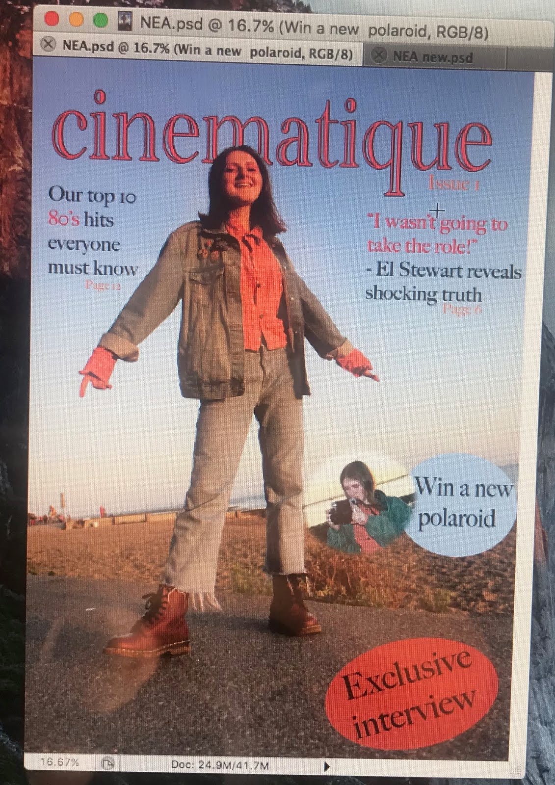
2) I changed the brand name to a red colour to match the stranger things colour palette. I was just experimenting with the layout of text and how that would look on the cover.

3) I cut out my model and put her infront of a cloudy sunset photo that I had taken in the summer holidays. This connotes a sense of fantasy and mystery. I got inspiration from the magazine cover of 'Satellite and TV'. I added a tagline 'We live and breathe film & tv' as I think this really shows what the magazine is about.
 4) When looking into other film and television (or entertainment magazines in general) I noticed that they were all very busy so I added small features of stories around the over. Also, the subjects were more focused on their upper body or face, so I cropped the subject so she was closer and I thought this was a successful change.
No comments:
Post a Comment