Sunday, 23 February 2020

WEBSITE screenshots

 Top of the home page
I have added the polaroids either side of the title of the 'back to the 80s' new trailer as I think it adds to the aesthetic and theme of the 80s. A polaroid photo is globally iconic as being part of the 80s vibe.
Furthermore, the first edition of my magazine has a competition for an instax camera that takes instant photos in the format of a polaroid.

To show the interactivity of the website and brand I wanted to show tweets that the consumers have made by using the #back2the80s. This also means that the readers are engaging with the new film trailer which is exclusive to cinematique. By using tweets it adheres to the target demographic of 16-25 as this is the main audience that uses twitter. 

My print cover and online website are digitally convergent due to the consistent link between them. For example, on the Friends issue there is a mention of a competition to friends fest in London and it says to look at the website for more information. Therefore I have made sure that there is an emphasis on the website for people to find out how to enter. The competition further allows the audience to interact with each other and with the brand as they can form a community and watch each others videos.

Different articles revolving around the theme of Film and Television
 The photo changes when hovered over to show a diverse range of original photos
 Making readers feel involved by being featured on the website.


Tuesday, 21 January 2020


Monday, 20 January 2020


Friday, 29 November 2019
AUDIENCE RESEARCH Feedback
After getting feedback from my peers they came to the conclusion that my text type was too large and the whole layout needed to be a lot smaller.
I also needed to add an editors note which can be seen on the bottom right hand side.

Here I am in the process of making everything look smaller and neater.
I also needed to add an editors note which can be seen on the bottom right hand side.

Here I am in the process of making everything look smaller and neater.
Wednesday, 13 November 2019
PRODUCTION Audio Visual content
My audio visual is a cross between a trailer and a short movie preview of the film 'Back to the 80's'
There are various techniques and intertextual references that I used in the video including the filter 'bad tv' to go over the visual content when she wakes up surrounded by 80's objects. Also, at the start there is a stranger things poster by her bed although this is hard to see. Later on there is a 'back to the future' poster which resonates with the idea of the 'back to the 80's film'
WEBSITE screenshots
Home page

When you first enter the website you immediately see the image above. An introduction to the brand is shown. I think that this creates a friendly tone for the reader. 'We live and breathe Film&TV' Is in large letters as this is the slogan for my brand, and I wanted this to be prominent throughout my products.


These three images are a slideshow underneath the welcome message to give a preview into what is to come.
The background matches the background of my two images, cloudy, but a sunset.
Exclusive Interviews


This is the interview of 'El' Who is the main face of the issue. Therefore I thought it would be important to include only a small part of her interview.... the readers will have to buy the magazine to read the rest :)

Left is when you hover over one of the boxes it reveals a quote that has been said in the interview- I think that this is a nice interesting touch to break up the layout and make it more enticing for the reader. I also think that this layout fits my target demographic more successfully than if the interview was just in columns.
Monday, 11 November 2019


Saturday, 9 November 2019
DEVELOPING choosing a brand name
After establishing that I wanted to do a magazine based around Film and TV, I wanted my brand name to reflect the content of the magazine. I looked into a number of words that summed up the brand. These were
Cinema
Cinematic
Aesthetics
Camera
Focus
I played around with some of these words in different languages and when I translated 'Cinematique' into French I got 'Cinematique' I really liked this and I conducted some audience feedback to my primary demographic on the name.
The outcome was that 95% thought that the name connoted themes of 'cinema' and 'movies' and 100% of people liked the name and thought it was unique
I also decided to stick with this name as the French twist gives the sense of sophistication to the brand. It isn't just another cheap entertainment magazine, so therefore I chose a price that would fit the branding.
DEVELOPING of Issue 1
 1) My first issue started off with my subject standing on the road with a blue background sky. However, after feedback, I came to the same conclusion as them. The setting was too realistic to be associated with stranger things, as it has a strong fantasy element to it. Also the colour palette of stranger things is more of a red colour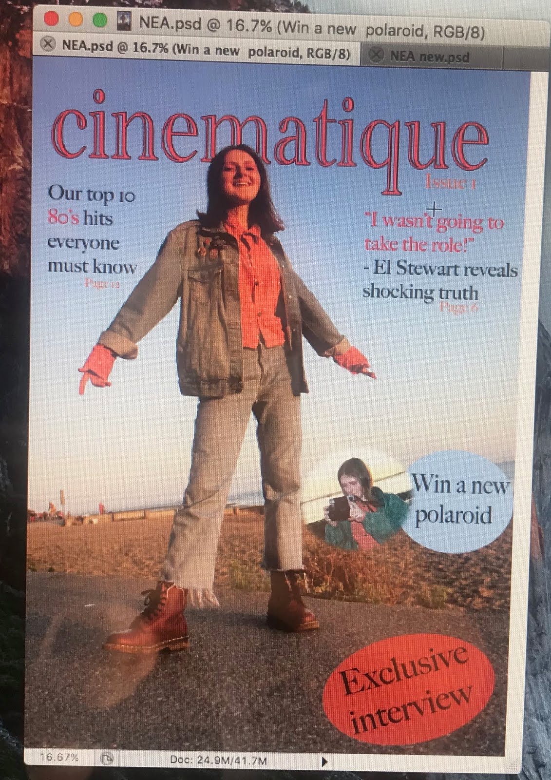
2) I changed the brand name to a red colour to match the stranger things colour palette. I was just experimenting with the layout of text and how that would look on the cover.


3) I cut out my model and put her infront of a cloudy sunset photo that I had taken in the summer holidays. This connotes a sense of fantasy and mystery. I got inspiration from the magazine cover of 'Satellite and TV'. I added a tagline 'We live and breathe film & tv' as I think this really shows what the magazine is about.
 4) When looking into other film and television (or entertainment magazines in general) I noticed that they were all very busy so I added small features of stories around the over. Also, the subjects were more focused on their upper body or face, so I cropped the subject so she was closer and I thought this was a successful change.
Monday, 21 October 2019
PRODUCTION issue 2 Friends Photoshoot
I wanted to redo one of the more iconic photos from friends and one immediately came to mind


My biggest challenge was sourcing all the umbrellas, not many people have a plain bright yellow umbrella! The models that I chose were brilliant and very patient when finding the perfect position for all the umbreallas and I am very happy with how they turned out.
DEVELOPING Second Issue ideas
Issue two
My first issue was based on a singular teenage girl and was solely focused on her so for my second issue I wanted to have a large contrast to this.
I thought it would be a good idea to do a group of people with mixed genders as I hadn't had any males on the first front cover.
As my magazine is a Film&TV magazine, my second issue was going to be focused on a television program, as the other issue was based on a new film coming out.
Upon doing research on the target demographic, I found out that the TV show 'Friends' was becoming more and more popular by the week and young adults were referring it as 'one of the most iconic sitcoms of the century' This is because of its introduction onto the streaming platform Netflix. This makes Friends highly accessible and has been the talk around 16-24, especially those who were born in the mid-late 90's and early 2000's as this would have been after their time.
Furthermore, Friends has been in the news a lot recently due to their 25th anniversary meaning that everyone will have heard of it.
Wednesday, 25 September 2019
PRODUCTION Photoshoot - Issue 1
Choosing My Model
I chose someone who I knew would be confident infant of the camera, Ellie has a strong drama based background so isn't afraid to be infant of a crowd. Furthermore, when I decided on creating an 80's themed project, she immediately came to mind as her clothing aesthetic is 70's and 80's vibe.
Choosing the setting
In Order to get a 'fun loving' yet natural feel to the photo I thought about the places that I would go as a teenager and chalk well beach is only a short walk from my house so I figured that it would be the perfect place to do it.


I chose someone who I knew would be confident infant of the camera, Ellie has a strong drama based background so isn't afraid to be infant of a crowd. Furthermore, when I decided on creating an 80's themed project, she immediately came to mind as her clothing aesthetic is 70's and 80's vibe.
Choosing the setting
In Order to get a 'fun loving' yet natural feel to the photo I thought about the places that I would go as a teenager and chalk well beach is only a short walk from my house so I figured that it would be the perfect place to do it.


Subscribe to:
Posts (Atom)